Friday, March 11, 2011

BLOG ASSIGNMENT #10 ( THE LAST ONE)


Karim Rashid’s Creative Manifesto:
Karim Rashid is very creative person. In his points, there are several ones speak to me the most.
1.      Never say: “I could have done that” because you didn’t.
To be honest, I choose this point because I strongly agree with him at this part. Being confident is a very important quality in creative life; however, we can not guarantee that we won’t have any other interesting ideas in the future. In addition, however strong you are, there is always someone stronger. We should be confident, but we can’t be arrogant.
2.      Normal is not good.
This point let me thinking a lot. I always believe normal things can be easily accepted by people. If a production can not be accepted by the masses, I even didn’t believe that is a successful piece. After I saw Karim’s design, I started to change my opinion. His designs are the things that we can use in our normal life, but his ideas are not normal. He tries to make his productions looks different, and unusual. I really like the colors he chose for each of his productions. He is good at making normal production become different. Basically, I think it will be help me in the creative process and creative life. I am changing my visual angle for what the real creative life is. Normal is not wrong, but it is not good.
3.      Experience is the most important part of living, and the exchange of ideas and human contact is all life really is. Space and objects can encourage increased experiences or distract from our experiences.
Before I read his points, I believe people’s life need experiences. However, I didn’t realize that the exchange of ideas and human contact is all life really is. After I read this point, I start to think it. When I was creating something, I was actually creating an idea. Then, I can exchange that idea with some other people’s ideas. That’s what we do everyday. When we go to the class, we are contact with our teachers and other students. When we are talking with someone, we are exchanging ideas with them.
4.      Here and now is all we’ve got.
   This is also an interesting point in his ideas. Actually, I agree with him. The passed time is like sand, we can not hold it. The future, we also can not predict what will be happened. We are living right now, this time. What we can hold is right now. Only we try to use every time in our life, we can hold our whole life. This is not about what we can predict; this is about how much time we can hold in our life.
Correlation between Karim’s manifesto and his work:
I believe there is a compact connection between Karim’s manifesto and his work. Because of the understanding of life and creative process, he knows what he needs to do. Also, because of those points, he can fix his weaknesses. The more clearly he understands the creative life, the more amazing productions we can create.                  
 

BLOG ASSIGNMENT #10 (Written response to FREAK FACTOR)

Link to FREAK FACTOR: http://changethis.com/

Written response
Summary/Critique:
           The reading “The Freak Factor” which was written by David Rendall is a really useful resource for all people. He explained a very normal problem that everybody has: our flaws and strengths. He explained his ideas by using nine different parts. First, what’s your problem? In this part, he gave the reader three choices for self-improvement. Those are fix weaknesses, build on strengths, and do both of them. He also mentioned that on one can be well-rounded. In the second point, he pointed out three basic ideas, those are, there is nothing wrong with you, you find success when you find the right fit, and your weaknesses make you different. In the third point, he explained that everybody has different characteristics. Every flaw has a corresponding strength. In the fourth point, he pointed out a real fact which is, we all have limitations. Then, we need to build on our strengths, if we don’t, we lost it. He also explained that we need to find a right spot for ourselves and we need to make our strengths and situations fixed. Basically, in this reading, David told people how to find and use weaknesses and strengths, and using them to make ourselves become success.
Respond:
1. What’s your problem?
I think the first suggestion is the most important one to overcoming weaknesses, it is absolutely valid. The reason is, before we start to improve ourselves, we have to know and understand what our problems are. There is nothing important than understand ourselves, meanwhile, there is nothing harder than realize what problem we have. I am pretty agreeing what David said in this article, no one can be well-rounded. What I thought for myself is, in order to have a better personality, improving my creative skills, I need to fix my weaknesses and build on my strengths every day. It looks like an easiest work during a day, however, that’s not easy if I keep doing that every day. Not just for me, I think it is also hard for everyone.
4. Don’t try to fix your weaknesses.
Many people pay too much tension on their weaknesses. They believed that other people will only focusing on their flaws. The reason I choose this suggestion is no one will be perfect, no matter who you are. Everyone has limitations in some areas. Also, this is equal for everyone. In addition, I think after I put my weaknesses away, I can do better for my job, work, or even some creative projects. If I don’t try to fix my weaknesses, I will have more time on my job; also, I will have more space for my work. Weaknesses like chains, they can lock my imagination, lock my creative process.
5. Build on your strengths.
What an important suggestion is, people are proud of their strengths. In order to make our strengths stronger, we need to build on it forever. I agree this idea is valid because many people spend too much time on fixing their weaknesses, time after time, their strengths have no improvement. The result is they are just normal person without any characteristics. No special weaknesses, no special strengths. For myself, I believe that building on my strengths can make my characteristics more clear and special. Also, during the process I build on my strengths, I can find out and create what my creative way is, what my style is.
My strengths and weaknesses (the creative process):
When I try to create something, I always care about what other people’s attitude on my work. I think that’s not a good habit. The reason is, when I start to caring those attitude, I will waste too much time on thinking about what will happen after people look at my project. I care about that too much, if they like my works how can I improve it in the future; if they don’t, I will spend more time on why they don’t like it. Actually, I just start to create it, however, I am thinking too much. It will block my creative process.
My strength is, I think I have a great imagination. Actually, we need a good imagination when we create something. To be honest, I think it is really important to be a successful creator.   

BLOG ASSIGNMENT #9 (Audio response to Collapsus)


 Link to the collapsus: www.Collapsus.com


BLOG ASSIGNMENT #9 (Reflection on the Gaming presentation)


Game Design


Reflection :
For the game design, our group did a RPG game called Aberdeen. I think we still need some works for the rules in our presentation. It is a little bit hard to explain the rules for our game, especially the point that players can switch between the protagonists when they are playing. We didn’t write that players can switch only between Carson and Adele. Also, I think we need more rules when we switch protagonists. For instance, we can add some different special skills for each one, such as the man character (Carson) is good at fighting with the evil colleague( Donovan), the woman character (Adele) is good at finding the lost piece for the time machine. Therefore, if you need to find the lost piece now, you can change to the woman protagonist, or if you need to fight with the evil colleague, you can switch to the man protagonist. I think that will be more specific and clear for our game.
Objectives in our game are also a hard part to explain and understand. If the player didn't win the fighting between Carson and Donovan, he must restart the level which he failed. So, when the players finding all the pieces for the time machine, our game is end. 
       I think we did pretty well for our goals, and I really thought our game can be invested to a game company. Our audience is young adults who are interested in history and steam punk, because our ideas for the outfits and clothing were came from steam punk. So, I think the visual effects could be amazing. In addition, we have a clear goal list, which are finding missing pieces of time machine and progress though levels of increasing difficulty. Those are very clear and easy to understand what the audience is going to achieve in the game.
Mechanics is the part which I believe is the easiest part for a game design, because when you are design the mechanic, you just decide which button used for what function.  
       

BLOG ASSIGNMENT #8 (Written Reflection on the Hero/Villain)

This is my character (Bubble Bath Man--Hero).
This is Madolyn's character (Dr. Dirty Nasty--Villain).
This is our animation.
          In the first team, they created Petroleum Man as their hero. For this character, they used blue and yellow to paint his diving suit. Also, in order to create the shadows, they used a little dark blue for the diving suit. Also, in lighting, they give the hero a body shape like a human being. Because of the light and color used, it can attract audience’s eyes. The lighting used for the diver’s body is contrast with his background which color is darker than it. Therefore, they hide this character as the main object in this picture. For the lighting they created on the hammer, it is a symbolism which showed the audience this character’s power. They used lighting to create a serious mood for the hero. It looks like that the hero is ready to fight with the villain.
      For their villain, they did Merman. They covered Merman with yellow hair, blue upper body with turquoise fishtail, and also a hand crutch. In order to create the shadows, they used darker turquoise for Merman’s fishtail. In lighting, they used an extremely white background to give the villain’s body shape. I think that they want to focus on the fishtail. In addition, they hide this character as the main object in this picture. They also drew a red mark with a white background on the character’s upper body, and give the light to make the mark as a symbolism for the villain. Meanwhile, they gave the villain a serious mood, as he was ready to fight with the hero.
       Contrast/Affinity:
       This team gave their characters similar color, which shows they want to create an affinity effect on the color.
       For the contrast, they created different lighting background for each character.
       Text/Subtext:
       In their two images, there are no text which can tell the audience their idea, so they use subtext to tell the audience what their characters are and what the main power their characters have. 


              In the second team, they created both characters having a human body look. For the hue, they drew these two characters by using very similar colors. They both have brown, black, white, grey, red and a little bit yellow and blue. Here, they used black and white, which are complementary in color schemes. In their villain character’s image, they chose red as their specific hue in the background; however, they also used monochromatic way to make it having different values and saturations. In their hero character’s image, there is a big circle after the character, I think they chose grey as it color, but they used monochromatic way to make it became hyaline. For the brightness, I think they used almost the same level for their two images except the bottom in the villain image’s background.
         Contrast/Affinity:
         The main tone for their two images are very similar, those are affinity. They also gave both of their characters human body shape. However, the villain’s background is contrast with the hero’s background. They created a gradient color for their villain’s background, but they created a mixed color for their hero’s background, which are dark brown and light brown.      
          Text/Subtext:
          For their villain, they didn’t put any text in the image, audience may guess what the exactly power or function this character has. That’s subtext. However, they gave their hero a piece of paper which wrote “CITY LINITS” in the image. Therefore, audience can understand which power this character has and what job this character has. That is text.   


            In the third team’s animation, they created a straight ahead action for their hero at the beginning. After the girl (hero) shoots the villain, the villain became mud. Here, they used squash and stretch to express that effect. For the overlapping movements, when the villain was run after the hero, the hero’s legs were moving faster than her arms, which showed a different rate at the same time. For the parallel movements, the hero moved slower than the villain, however, the hero can jump when she was running after the villain. For weight, because of the smaller size of the villain, they created a faster movement for that. Also, they created a slower movement for the hero, because she has a heavy weight.
         Contrast/ Affinity:
         The size of the hero and villain is contrast with each other. The hero has a bigger human body, and the villain has a small circle body. Also, the hero can jump can jump very high, but the villain can’t. In addition, these two characters have different movement rate, the hero is slow and the villain is fast. 
         Text/Subtext:
         This piece of animation used a subtext way, the creators didn’t give any words for the explanation. They want to focus on their animation, and let the audience understand the play and the characters by themselves. 

BLOG ASSIGNMENT #8 (Audio response to This American Life)


Link to This American Life :www.thisamericanlife.org/radio-archives/episode/178/superpowers


Superhero tat has the power  that I wish I had ---the fortune teller.


Tuesday, March 1, 2011

Blog Assignment #7


 Both videos have been posted below.


Meng Li
Eric R. Williams
MDIA 203
Feb 28th, 2011
Blog assignment #7
Joke Videos
Based on the two joke videos my team produced, I want to focus talking about the movement and the line for each one.
First, the movement we created was contrast between each other. The first video which has a warm and yellow old style overall, we changed the movement to very fast for each character. The reason is we want to create this one like a short situation comedy. Also, we used fast movement to create a joke effect. We also use point of interest to produce the conversation between the two characters, even though they were talking by using a phone. Because the two characters were all sitting at a desk, so basically, there was no direction for their movement. For the second video which has a black and white style, the movement for the girl was medium, just like general walking. Also, her movement showed her direction, toward to the man who was sitting in the room. To be contrast, the man’s movement was faster than the girl because he was a successful and arrogant lawyer. He was more confident than the little office girl. Meanwhile, to shoot the girl’s movement, we used a simple horizontal move. The girl’s movement was also an object movement.
Second, the line we used in the first video was contrast with the second one. In the first video, both characters were sitting at a desk, their bodies both showed up curvilinear beside a desk. To be contrast, the second video we shoot was using both straight line and curvilinear line. When the girl standing in the lawyer’s office, the girl showed a straight line and the lawyer who was sitting there showed a curvilinear line. So, both straight line and curvilinear line were showed in one frame this time. Last but not the least, in the second video, we have an extreme close up shot for the lawyer, in that shot, there was a virtual line for where the lawyer’s eye looking at.    
For these two videos, they are all old styles because of the main color we used. One is a kind of warm and yellow color, the other one is black and white color. So, these videos are affinity in this part.
In the first video, the audience will look at the words about what the characters talking about on the screen. Actually, here, we used subtext telling the audience what the joke is talking about. For the second video, the audiences can here the explanation and the texts at the same time. So, we used text for the second video.                       

Sunday, February 27, 2011

Character Design

 
this is my character.
this is Madolyn's character.
 
This is our animation.

Monday, February 14, 2011

BLOG ASSIGNMENT #5A


Meng Li
Eric R. Williams
MDIA 203
Feb 14th, 2011
Blog assignment #5A
Reimagining Visual Framing
The image choose from the soundscape assignment is the one from Helen Frankenthaler. The reason I chose this one is, I love the main color that Helen used. It is yellow. Even though I like this piece of art a lot, I also reframe it by using some emotion in my way. Therefore, there are some similarities and differences between the original image and the reframe one.
The similarities between these two images are visual movement, and line and shape. In these two pictures, the movements are all complex moves. There is a main point in the center of the picture, then, it has seven lines moved radially. The direction for each line is the same. The lines in these two pictures are all curved lines. Meanwhile, these two picture are square, and the shapes which made by lines are circle.
The difference between these two pictures is the visual intensity. This also is the part I changed a lot. When you see these two images you may find, the color for the original one is more dark, massive and deeper. Every element in this image is clear. You can see the lines, milk-white line with a little bit shadow, the little dark point in the image at the left side, the brown little line at the bottom and also the red point in this image. To be contrast, the one that I reframed is brighter, lighter, and dimmer. The way I changed is, I make the whole image color boost first, and then I make the edge softness to eight. The last thing I changed in the image is, making restore ancient to one. The reason I reframed by this way is, I want to focus the bright yellow in people’s heart. The milk-white color in the center is the most brightness part, then, there are several unclear cracks ray from it. That represent every people should have some bad memories. The brown color represents the darkness in people’s heart. That represents my emotion: the nature of human is evil.
To be contrast, the way that Helen drawn this image is darker overall. However, it looks like a beautiful life living in a big yellow leaf. I still believe that Helen did a better job than me because she using the color more natural and more accord.
In the original image, the color used shows an affinity way. The colors that she used are yellow, red, white and brown. There is no big contrast between colors. Also, she used subtext way, she didn’t use any specific thing to tell people what she drawn. She gave the audience many imagine area.


Sunday, February 6, 2011

New Music Reflection

New Soundscape Reflection

Tuesday, February 1, 2011

Dan Wainio's Blog: Song Assignment

Dan Wainio's Blog: Song Assignment

Alex Wiseman MDIA 203: music/song project

Alex Wiseman MDIA 203: music/song project

Madolyn Nianouris: Song Post - "Explosions"

Madolyn Nianouris: Song Post - "Explosions"

MUSIC/SONG REFLECTION

Soundscape-Matthew Johns

Matthew's Weekly Brain Bubbles: Soundscape!

Soundscape-Jillian Gates

Love.Live.Music: Soundscape Project: "Emotion: An 'AH-HA' Moment"

Soundscape-Katie Everett

Katie Everett: Soundscape: "Emotion: Getting Yelled At"

Monday, January 31, 2011

Audio Reflection Soundscape-Meng

Sunday, January 30, 2011

MENG'S LIST

Wednesday, January 26, 2011

BLOG ASSIGNMENT #4A

       Article: Seth Godin's "Brainwashed". http://changethis.com/
       In the article "Brainwashed" , written by Seth Godin, he elaborated seven ways for people to reinvent themselves. There is a way called "Acknowledge the Lizard". He pointed out that the lizard brain is a prehistoric brainstem which all the people should against with it. In another word, the lizard is the resistance in our mind and head. When we have a new idea, we may hesitate , here, the lizard start to work. We may worry about the idea if it is really good one or it is a breakthrough idea. If we fear to try it, the lizard brain win. However, if we acknowledge it, we can ignore it. 
        "Connect" also is a way explained in Seth's article. We are all connected with the world today, we are not alone. To be connected means we can learn, earn and even achieve something that we've never thought. Stay in a cage means failure, we have to create the connection if we want to grasp the right, the power. 
         According to this article, I realized that, first, these two ways that I summarized above are really useful to myself. Second, the assignments and the projects that I created in the Blog or in the lab are really useful for my creating life. The reason I say that is, those assignments are creative, they can drill my creative thinking. When I was doing those exercises, I can let all my creative ideas point out, and choose the one which I need from them. I believe those assignments can help me become a better artist. 
         On the other hand, for the creative process class, we can learn more process about how the great music, songs or movies created. It can be useful when I create my own project.    

Sunday, January 23, 2011

BLOG ASSIGNMENT #3A


 This is the original song "Thank You" by Dido.

This is the covered song "Thank You" by Yilin Cai.

Meng Li
Eric R. Williams
MDIA 203
Jan 23rd, 2011
Blog assignment #3A
Exploration of Cover Songs
“Thank You” is a song that a loved very much, this song is not only performed by Dido, also performed by a Chinese singer, Yilin Cai. Even though each performer uses the same name of this song, they also have some similarities and differences.
The first part I want to discuss is the similarities of these two songs. Actually, the original song and the covered song are both use the same lyrics and melody. The melody of these two songs is brisk and a little bit lazy. When the audience are listening these songs, they can feel very comfortable and forget their stress. The lyricist uses some words like window, best day, thank you and life to show up a warm and comfortable feeling in this song.
Next, although the original one and the covered song have the same lyrics and melody, they also have some differences. The first one is the intensity of these two songs. For instance, the original song uses softer intensity. Even though at the climax part, the singer still uses a medium volume to perform. However, for the covered song, the Chinese singer uses louder intensity. Therefore, the singer’s sound became the main point in the song.
The second different between these two songs is their pitch. For the original one, the pitch is lower. Therefore, it can help the intensity of this song become softer. In contrast, the pitch in the covered one is higher. However, the pitch in the beginning of these two songs is switched. The original one’s drumbeat pitch is higher and the covered one’s drumbeat pitch is lower.
These two songs are active because the lyricist put words into the songs, and they are not just having music. The lyricist for these two songs wants to show up what is the theme of the song, so he uses words, sentences and music to make this song completely. Therefore, the audience can easily understand what the singer is singing about. But, there are many parts in the song just have music. For this case, the lyricist uses a didactic way to make each sentences connected. So, the audiences can still focusing on this song when there are no words sometimes. It can keep the audiences pay attention, and let them blend in the environment which the song created.
These two songs are all not contrast. The music is soft and coherent, but no big ups and downs. So, they are all use affinity to create the music, and there is a process between the beginning from the song to the climax part, then there is a process from the climax part to the ending.
To be honest, I love the original one better because it uses a softer intensity to explore the song. Also, I think the singer’s sound from the original one feels like more comfortable. She uses a steady sound to explore the song, and I love her timbre from the song. Actually, I really like the dubbing from the original one. There are many different dubbing sounds in it, so the song is more complex than the covered one.                              

Monday, January 17, 2011

BLOG ASSIGNMENT #1 (1B)

Mitch Ditkoff, 14 Ways to Get Breakthrough Ideas.  http://changethis.com/ 
According to the article “14 Ways to Get Breakthrough Ideas” written by Mitch Ditkoff, people can get best ideas in many ways. Also, people can get their extraordinary ideas without analysis, read, or research some boring data. People have habits or any other actions that can get their attention, therefore, when people doing things they like to do, they will receive something special occasionally or unexpected. However, we can’t just doing things what we like, we have to do something that we hate. When we face this time, there is another way to let ourselves getting into it, that is immerse. We must forget the feeling of hate, bored or any other obstacles. We have to enjoy what we are doing, and then our brain can start working. In Mitch’s article, he uses an example about hatching to explain his opinion which is really attracting my eyes. That example can deeply explain why we need to immerse. When we get one idea, we can’t stop working because we have to tolerate ambiguity. The idea that appeared in our mind is not the result, it’s just an idea. We do not know if it will be a fabulous project or awful rubbish. The first thing we need to do is accept that idea and accept an area called “grey zone”. The reason is, we are thinking about a breakthrough idea. Another way in Mitch’s article is make new connections. People are used to live in their world what they are already known. We need to create some new things, new connections in order to get some breakthrough ideas. Mitch thought the more we are willing to get out the box we have already owned, the more likely a new connection will be appeared. The fifth way that Mitch mentioned in this article is fantasize. Many people agree that fantasize is not a good habit in our daily life. However, they do not know, many breakthrough ideas were born when we stay in our own world. That’s what Mitch told, “Use the imagination”. Sometimes people can’t get the breakthrough idea because they get the wrong problem. Therefore, there is a way called “define the right challenge”. The seventh way is “listen to your subconscious”, which means that breakthroughs almost always came after extensive periods of intense. The strong example for this method that I believed is Rene Descartes got the idea for the Scientific Method in a dream. Actually, our mind will keep the breakthrough under our subconscious, and figure it out in its own. Next method, take a break. I believe that is a great method to get a breakthrough idea. There is a logic in the article, the more obsession, analysis or effort we do, the less ideas, solutions or results we receive. The ninth way is notice and challenge existing patterns and trends. Many old patterns will be reconfigured in new ways by breakthrough thinkers. The next way is hang out with diverse groups of people. Mitch suggests that people need to break the bonds of the familiar, and contact with people outside of their field. We can get new ideas, thinking ways or emotion by using this way. That is a way straight to a breakthrough idea. The next one is brainstorm. Under this way, we gather all the well and good, we receive other people’s spark ideas. There is a strong example for this part, Steve Jobs and Steve Wozniak. Breakthrough ideas will also appear when we are looking for happy accidents. We need the ability to notice something new and unexpected in our life. That will give us inspiration for our spark ideas. Another way to get a breakthrough idea is, use creative thinking techniques. This technique is like a jumper cable, it can help us keep our brain working, and escape stuck. The last way in Mitch‘s article is, suspend logic. What we need to do is, stop our judgment, and stop our evaluation for a moment, breakthrough idea is right there, on the other side. I believe all the ways in this article are valid and effective and I will try to use them in my own creative life.
In my mind, the most attractive ideas in this article are, follow your fascination, fantasize and hang out with diverse groups of people. I think those three ways can be used in my own creative life, and they can be worked very well. The first one is fascination. I believe that the most attractive thing during our daily life is, we can do whatever we want. During that time, my brain can work efficiently without any break. The reason is, I am exciting at that time, not only my body, but also my mind and brain. The next great way in this article is, fantasize. I love fantasize because my mind is travelling at that time. I can image any unreliable actions, things or ideas. They are like many bugs in my mind, and they are jumping any way they want. The last one is, hang out with diverse groups of people. This one will help me in my creative life a lot. This is a fast way to get what other people are thinking about. I can realize some different ways of thinking when I am talking with other people. Even though I will not other people’s idea, I can escape the idea that has been already done by other people. Therefore, I can create some other new ideas.
Question #11 in this article: What is the topic of your next group brainstorm? Who will you invite? Who will facilitate? When?
Topic: what is the real goal in people’s life?
I will invite my father and my boyfriend to discuss this topic at our next weekend dinner. I think my father will be the person who will facilitate.          

Wednesday, January 12, 2011

BLOG ASSIGNMENT #1 (1A)

         I believe that I'm a "almost" creative person. The reason is that there are some stuff which can give me some afflatus when I looking at them. For instance, the blue sky, the ocean and the night, all of them can give me a special feeling and emotion. When I was in high school, I always finish my homework until midnight, also, finishing work with a cup of coffee. I love doing some different unusual activities at night, such like creating some actions for my fittness class orcreating my own notes for the classes.
      
          Example A
          The person who inspired me a lot is Gabrielle Bonheuor, she was the first designer of "Coco chanel", and actually, she created this high fashion brand. Who have ever thought that she was just a singer at the begining. "Coco Before Chanel", a movie which was directed by Anne Fontiane, and brought my mind to the coco world. She used many contrast in this movie in order to show up the difference between Gabrielle's clothing and other ladies' clothing at that time. Gabrielle's clothing was made by herself, and she didn't like the complicated decoration. Therefore, the dress which she made was simple and good grace. She was good at using basic colored cloth to make her dress, such like black, white, grey or brown. However, ladies at that time like wearing colorful cloth, such as pink, red, green, and yellow. Also, the whole movie uses contrast to show Gabrielle's status changed after she became a successful fashion designer. In this movie, the director used affinity to describe other ladies' clothing. Their clothing were all beautiful and comply with the fashion at that time. They were all wearing skirts with corselets and palace formula hats. After I saw this movie, my beauty vision was totally changed. I was not like complicated clothing any more, instead, I believed that simple clothes can also show up people's personality. 
           
         This is the contrast between "Coco" and another lady at that time.
                              
Here is a official trailer for the movie "Coco Before Chanel". In this movie, Audrey Tautou plays the part of  Gabrielle Bonheuor.   
     

 Example B
        Transformers is an active movie which directed by Michael Bay. Even though this movie uses a lot of active scene, such as the Roberts fighting with human beings or the justicial team is fighting with the evil team. The part which attracted me is, the process of each Robert transforming from a vehicle. Michael uses 3D effect for the Roberts, and also, when the Roberts were transforming from vehicles, the nuanced visual effects told the audience how they worked. I can specifically remember each part of each vehicle transformed to a huge and powerful Robert. Michael didn’t use lines to describe how the Roberts transformed, he used a subtext to let audience know hoe it work. Actually, he gave most of vehicles a up view when they transformed. He just used sound and visual effects. I thought that was a great way to describe the transforming. The reason is, using only sound effects and visual effects can make the audience concentrate on how it works. This active movie shows people how advanced technology in the modern society is, meanwhile, Michael uses active way to show it up because active is more powerful than didactic.  This movie taught me about how to use new technology in a 3D movie, also, how meticulous a great movie should be.
  This picture as follow shows a vehicle chevrolet camaro transformed to a robert which called bumblebee. 
   Here is a movie trailer for Transformers 2.


       Example C
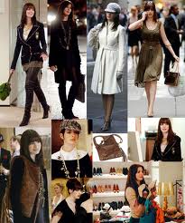
       Now, it’s the turn for my favorite movie The Devil Wears Prada. This movie was directed by David Frankel, also, I know this director because of this movie. David described a almost real life about the people who worked for a fashion magazine company, even involved the people who worked in Hollywood. In the movie The Devil Wears Prada, David not only showed how a fashion company worked, also told the audience how much competition and hardness you should face by using subconscious. Here is a group of scene that attracted me a lot: when Andrea Sachs (played by Anne Hathaway) worked in the Runway magazine company as Miranda Priestly’s (played by Meryl Streep) second assistant in the first a few days, she had to accept every demand from Miranda Priestly without any refuse. This movie uses many subtexts among groups of scene, and also, the changing between each scene was very fast. For that reason, it can attract the audience attention in an efficient way. In another way, this movie told a story in a fashion company, therefore, the appearance in this movie also was a big point. However, David was not made those luxury productions as a leader in this movie, he defined those productions as a assistant tool. I love this movie a lot because it shows a working speed and rule when people working for a company in the modern society. Actually, this movie gives me some tips for my future in the working area.   

Here is a picture which can show the fashion point for this movie.


Here is the movie trailer for The Devil Wears Prada.